User Guide
Chart of averages
The Shewart principle functions well for one part in theory, but in practical application it does not support the evasion of weak derivations in the procedure
Let us take the following example:
The procedure capability is 1.6, therefore we were able to calculate the limits of the control procedure and measure the black part.
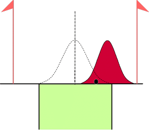
This part is well below the control limit, so we can not say that the process is off center. And yet, the process could well be off center (red curve) without being noticed.
The result of the measurement of a part is indeed the sum:
- Of the off-centering
- Of random variations in the procedure
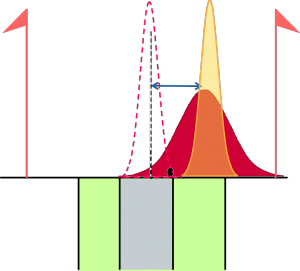
To be able to observe the type of de-centering, we use the fundamental average property:
Once an average is calculated using n parts, the dispersion of the mean of these n parts is much smaller than the dispersion of only one part;
If we use the preceding example by using an average of 5 parts:
-
Because the dispersion of the mean is much smaller, the control limits will also be much tighter (grey zone)
-
The average of the 5 parts will also be closer to the true de-centering procedure But, while using individual charts, the probability of detecting this de-centering was very small, and while using an averages chart the same decentering will be detected much faster.
Using Ellistat
To open an average values chart, enter the data in several consecutive columns, indicate the number of repetitions (the number of successive columns containing the data) and open the averages chart.
Using averages
It is sometimes easier to calculate the median of 3 or 5 parts than it is to calculate the mean/average. In this case, using the averages chart is preferable as it is simpler and contains practically the same properties as an averages chart.